The Bootstrap toolkit
Published on 2018-09-24
Bootstrap is a powerful toolkit for creating beautiful mobile-first web applications. In short, Bootstrap includes design templates and utilities for creating common components - i.e. grids, buttons, alerts, modals, tooltips, etc. To start creating designs with Bootstrap, you should first understand how to use HTML and CSS. Therefore, if you haven't read our previous tutorial on that topic, please click here and read that first.
We're going to start by presenting a starter template for using Bootstrap, then we're going to talk about several options for laying out elements in a grid, and finish up by discussing common Bootstrap components like buttons, forms, cards and modals. So, let's get started.
Starter template
Bootstrap is often used to create responsive websites that look good on all devices (smartphones, tablets, desktops, etc). To start using Bootstrap, you need to make sure you add the Bootstrap CSS (mandatory) and JavaScript (optional, to make sure all components work), as well as some dependencies (for example, jQuery is needed if you add the scripts). jQuery is a library that makes JavaScript easier to write and run on popular browsers (Firefox, Chrome, etc).
In short, this is a template you can use for your HTML pages that work with Bootstrap.
    <!doctype html>
    <html lang="en">
    <head>
    <meta charset="utf-8">
    <meta name="viewport" content="width=device-width, initial-scale=1, shrink-to-fit=no">

    <link rel="stylesheet" href="https://stackpath.bootstrapcdn.com/bootstrap/4.1.3/css/bootstrap.min.css" integrity="sha384-MCw98/SFnGE8fJT3GXwEOngsV7Zt27NXFoaoApmYm81iuXoPkFOJwJ8ERdknLPMO" crossorigin="anonymous">

    <title>A Bootstrap template!</title>
    </head>


    <body>
    <!-- The HTML contents go here -->


    <script src="https://code.jquery.com/jquery-3.3.1.slim.min.js" integrity="sha384-q8i/X+965DzO0rT7abK41JStQIAqVgRVzpbzo5smXKp4YfRvH+8abtTE1Pi6jizo" crossorigin="anonymous"></script>
    <script src="https://cdnjs.cloudflare.com/ajax/libs/popper.js/1.14.3/umd/popper.min.js" integrity="sha384-ZMP7rVo3mIykV+2+9J3UJ46jBk0WLaUAdn689aCwoqbBJiSnjAK/l8WvCWPIPm49" crossorigin="anonymous"></script>
    <script src="https://stackpath.bootstrapcdn.com/bootstrap/4.1.3/js/bootstrap.min.js" integrity="sha384-ChfqqxuZUCnJSK3+MXmPNIyE6ZbWh2IMqE241rYiqJxyMiZ6OW/JmZQ5stwEULTy" crossorigin="anonymous"></script>
    </body>
    </html>
Notice the responsive meta tag ("viewport"). With Bootstrap, we optimize code for mobile devices, and scale components for other devices using CSS media queries - i.e. queries that allow us to have different CSS rules based on the screen size. Similarly, notice that we have all scripts at the end of the body, in the correct order (jQuery, Popper.js, and then Bootstrap) - that is, the Bootstrap scripts go at the end, after the required dependencies.
Finally, it's worth pointing out that we have links to styles and scripts for Bootstrap version 4.1.3 (you can see that from the urls). To get the latest version of Bootstrap, you can google the phrase "bootstrap 4 getting started", and go from there.
Containers, rows and columns
Containers are the most basic layout element in Bootstrap, allowing you to create pages that look great on all devices. All of your Bootstrap pages will contain one or more containers. Based on your project requirements, you can choose between a fixed-width container (class "container") or a full-width container that takes the entire screen width (class "container-fluid").
We will mostly be using the "container" class in our examples, as it's more common. In short, a fixed-width container means that the width of the container (where everything will be shown), will depend on the screen size - for smartphones, the width will be 576px, for desktops it will be 1200px, etc. This is actually pretty cool, because (as we'll see below), by using different column classes, we can easily outline how those columns should be presented based on the screen size (next to each other, one below the other, etc)
Here comes the only hard part in Bootstrap. Inside a container, we can have one or more divs that indicate rows (class "row"), and inside rows we will have one or more divs that indicate columns. Column classes will indicate the number of columns you like to use of the possible 12 per row. In other words, if you want three equal width columns that take an entire row (100%), you can use three divs with the class "col-4" (because "col-4", "col-4" and "col-4" will sum up to 3*4=12). If you want one column to take 50% of the width, and then two others to take up the remaining 50%, you can use the classes "col-6" (50% of 12 is 6), "col-3" and "col-3" (so, we will have "col-6", "col-3" and "col-3", which sum up to 6+3+3=12). I know this is difficult to understand at first, so let's go with an example.
    <!doctype html>
    <html lang="en">
    <head>
    <meta charset="utf-8">
    <meta name="viewport" content="width=device-width, initial-scale=1, shrink-to-fit=no">

    <link rel="stylesheet" href="https://stackpath.bootstrapcdn.com/bootstrap/4.1.3/css/bootstrap.min.css" integrity="sha384-MCw98/SFnGE8fJT3GXwEOngsV7Zt27NXFoaoApmYm81iuXoPkFOJwJ8ERdknLPMO" crossorigin="anonymous">

    <title>Containers</title>
    </head>


    <body>
    <!-- The HTML contents go here -->
    <div class="container">
        <div class="row">
          <div class="col-6">col-6</div>
          <div class="col-6">col-6</div>
        </div>
        <div class="row">
          <div class="col-8">col-8</div>
          <div class="col-4">col-4</div>
        </div>
        <div class="row">
          <div class="col-4">col-4</div>
          <div class="col-4">col-4</div>
          <div class="col-4">col-4</div>
        </div>
    </div>

    <script src="https://code.jquery.com/jquery-3.3.1.slim.min.js" integrity="sha384-q8i/X+965DzO0rT7abK41JStQIAqVgRVzpbzo5smXKp4YfRvH+8abtTE1Pi6jizo" crossorigin="anonymous"></script>
    <script src="https://cdnjs.cloudflare.com/ajax/libs/popper.js/1.14.3/umd/popper.min.js" integrity="sha384-ZMP7rVo3mIykV+2+9J3UJ46jBk0WLaUAdn689aCwoqbBJiSnjAK/l8WvCWPIPm49" crossorigin="anonymous"></script>
    <script src="https://stackpath.bootstrapcdn.com/bootstrap/4.1.3/js/bootstrap.min.js" integrity="sha384-ChfqqxuZUCnJSK3+MXmPNIyE6ZbWh2IMqE241rYiqJxyMiZ6OW/JmZQ5stwEULTy" crossorigin="anonymous"></script>
    </body>
    </html>
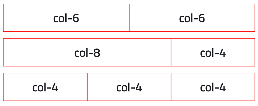
Notice from the source code above how we have three rows, and how all of them are inside the same container. The image below shows the result.
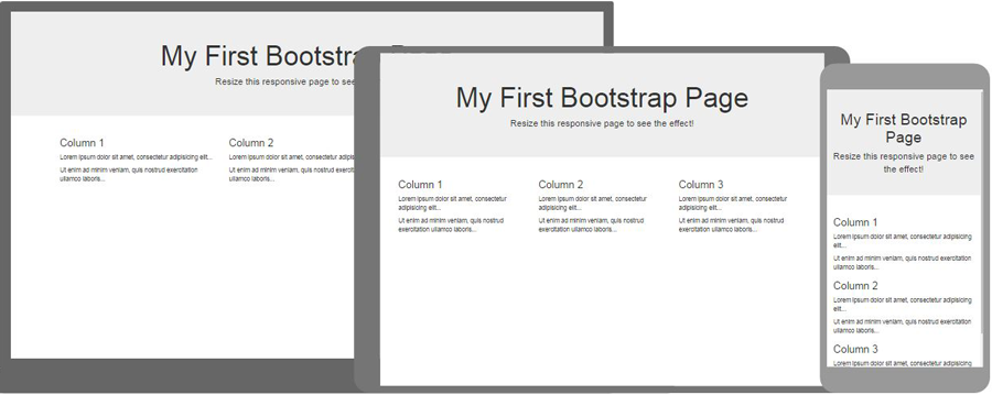
Feel free to take as much time as needed to understand the example above. Once you do, it's time to talk about different devices and how to use one HTML page to make a layout that looks good on all devices. If you look at the example above, you'll notice that all columns in each row will be presented in one line - no matter the screen size. But what if we want to have two columns next to each other on large screen sizes (e.g. desktops), but one below the other on smartphones (see image below). It turns out, this is very easy.
The classes for columns that we mentioned (col-1, col-2, ..., col-12) actually describe how our screen will look on smartphones - for other screen sizes, Bootstrap will just use the same layout because you haven't described how you want it displayed there. To do that, just use classes that contain "sm" (for landscape phones), "md" (for tablets), "lg" (for desktops) and "xl" (for extra large desktops, i.e. more than 1200px width). For example, if you have a div with the following class attribute "col-12 col-md-6 col-lg-4", that div will take up 100% of a line on phones (12), 50% on tablets and above (6), and 33% on desktops (4). By just appending all of those classes, we have made it possible to create layouts for all screen sizes (i.e. responsive design).
I know this might be hard to understand at first, but just try and play with it for an hour or so. Everything else in Bootstrap is much easier to understand. This is just hard because you (probably) haven't thought about responsive websites until now, and this looks like magic. After you play with a couple of examples, you'll understand that everything layout-related in Bootstrap comes down to just three things: containers, rows and columns. I can talk more, but the best route forward if you still have questions is to do some examples on your computer, and search for "bootstrap 4 grid" on Google and visit the Bootstrap website. It has a lot of examples and notes.
Components
As a beginner, the best way to add Bootstrap components is to open the Bootstrap documentation (available by a simple Google search), and then look at the Components page. There, you can find a list of classes to create Alerts, Badges, Buttons, Cards, Dropdowns, Forms, Modals, Tooltips, Pagination, Progress indicators, and a lot more. As you use more and more components, you will start remembering the (key) classes and to use them without looking at the documentation.
For example, if we open the documentation and look at the Alerts section, we see that we need to create a div with the class "alert", and an optional second class depending on the type of alert ("alert-success", "alert-danger", "alert-warning", etc). Easy enough, right?
Let's look at Buttons next. To add a button, we just use the button tag, and add the class "btn" to it. Again, there is an optional second class depending on the type of button you want to add ("btn-success", "btn-danger", etc). Similarly, for buttons, you can also modify their size with appropriate classes ("btn-lg" for a large button, "btn-sm" for a small button). See how easy Bootstrap is? You just add elements with appropriate classes. The classes are listed on Bootstrap's documentation page related to Components. Let's look at an example:
An example
The example above can be created with the following source code (which includes everything needed to get Bootstrap setup, i.e. it's a fully operational HTML page).
    <!doctype html>
    <html lang="en">
    <head>
    <meta charset="utf-8">
    <meta name="viewport" content="width=device-width, initial-scale=1, shrink-to-fit=no">

    <link rel="stylesheet" href="https://stackpath.bootstrapcdn.com/bootstrap/4.1.3/css/bootstrap.min.css" integrity="sha384-MCw98/SFnGE8fJT3GXwEOngsV7Zt27NXFoaoApmYm81iuXoPkFOJwJ8ERdknLPMO" crossorigin="anonymous">

    <title>Components</title>
    </head>


    <body>
    <!-- The HTML contents go here -->
    <div class="container">
        <div class="row">
          <div class="col-12">
              <div class="alert alert-danger">Watch out. This is an alert with classes "alert alert-danger".</div>
              <div class="alert alert-warning">Be careful. This is an alert with classes "alert alert-warning".</div>

              <div>
                  <button class="btn btn-success">btn-success</button>
                  <button class="btn btn-danger">btn-danger</button>
                  <button class="btn btn-info">btn-info</button>
              </div>
          </div>
        </div>
    </div>

    <script src="https://code.jquery.com/jquery-3.3.1.slim.min.js" integrity="sha384-q8i/X+965DzO0rT7abK41JStQIAqVgRVzpbzo5smXKp4YfRvH+8abtTE1Pi6jizo" crossorigin="anonymous"></script>
    <script src="https://cdnjs.cloudflare.com/ajax/libs/popper.js/1.14.3/umd/popper.min.js" integrity="sha384-ZMP7rVo3mIykV+2+9J3UJ46jBk0WLaUAdn689aCwoqbBJiSnjAK/l8WvCWPIPm49" crossorigin="anonymous"></script>
    <script src="https://stackpath.bootstrapcdn.com/bootstrap/4.1.3/js/bootstrap.min.js" integrity="sha384-ChfqqxuZUCnJSK3+MXmPNIyE6ZbWh2IMqE241rYiqJxyMiZ6OW/JmZQ5stwEULTy" crossorigin="anonymous"></script>
    </body>
    </html>
You should look at the Bootstrap documentation page and try to add a couple of other components. Remember, the hardest thing to learn with Bootstrap is the layout: containers, rows, and columns; and how they all help in creating a responsive website.
Finally, I should point out that it's possible to use CSS (and JavaScript) to modify the components - increase button size, color, font weight, etc. Bootstrap is just a toolkit with a predefined set of components that you can quickly add to a web page. Don't be scared to modify one or more elements on your page - i.e. if you believe a different color will look better, just use the color/background-color properties. It's as easy as that.